Light theme
1234

Lorem ipsum dolor sit amet, consectetur adipiscing elit, sed do eiusmod tempor incididunt ut labore et dolore magna aliqua.
Animations do more than just look cool — they enhance the user experience. Whether it’s guiding attention, creating a sense of flow, or making interactions more intuitive, the right animations and interactivity can transform a static page into something that inspires users and drives action.
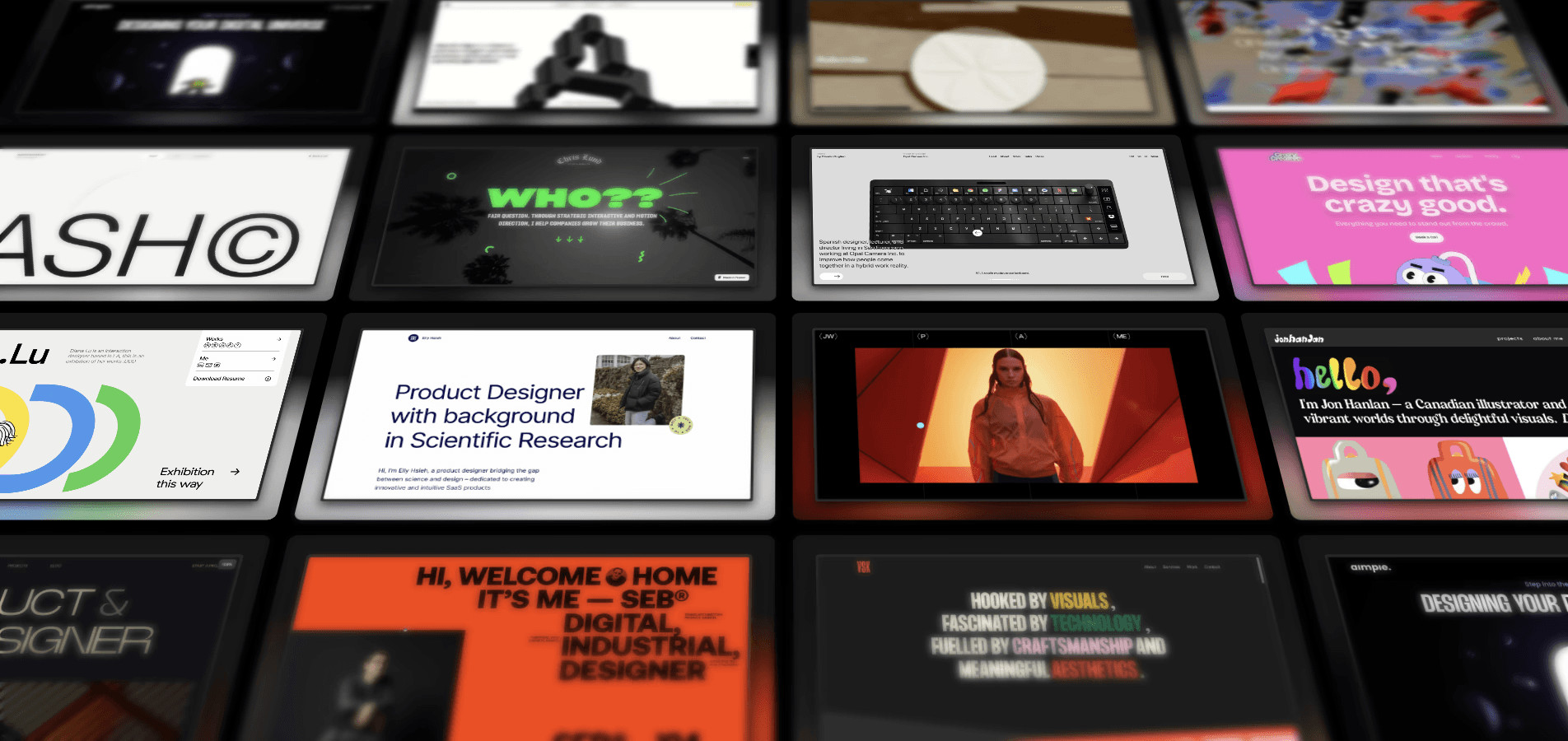
To inspire your next project, we’ve collected a set of stunning website animation examples from the Framer gallery. Explore how different types of animations — l ike hover effects, scroll-triggered transitions, and background animations — can differentiate your brand, enhance your user experience, and supercharge your conversion rates.
1. Background Animations
Adding background animations gives your website a sense of dynamism and interactivity. These effects can be subtle, as in the case of gradient animations; they can also be central to the design of your page, as many parallax backgrounds are. Either way, background animations are a way to enhance your site’s visual flow and set the tone as your visitors explore your site.
Example — Yuna

Yuna is an app that lets you create personalized, interactive children’s stories tailored to the age of your child. Parents say it fosters a love of reading and helps kids practice creativity and imagination. Yuna’s website does an excellent job of communicating that sense of wonder through storybook-like animations.
Parallax backgrounds play a big role here: three layers, moving at different speeds, show a parent reading to their child with colorful, slow-moving leaves and clouds in the foreground. As you scroll through the website, other visual features—like entrance animations and bouncing icons—reinforce this sense of playfulness.
2. Hover Effects
By using hover effects, you can signal to users which objects are clickable and important. Plus, it makes the experience of browsing your site more dynamic and engaging, while giving you a chance to reinforce your brand. Hover effects can be subtle, like adjusting the color, size, and orientation of buttons and menus, or more overt.
Example — Unifiers of Japan
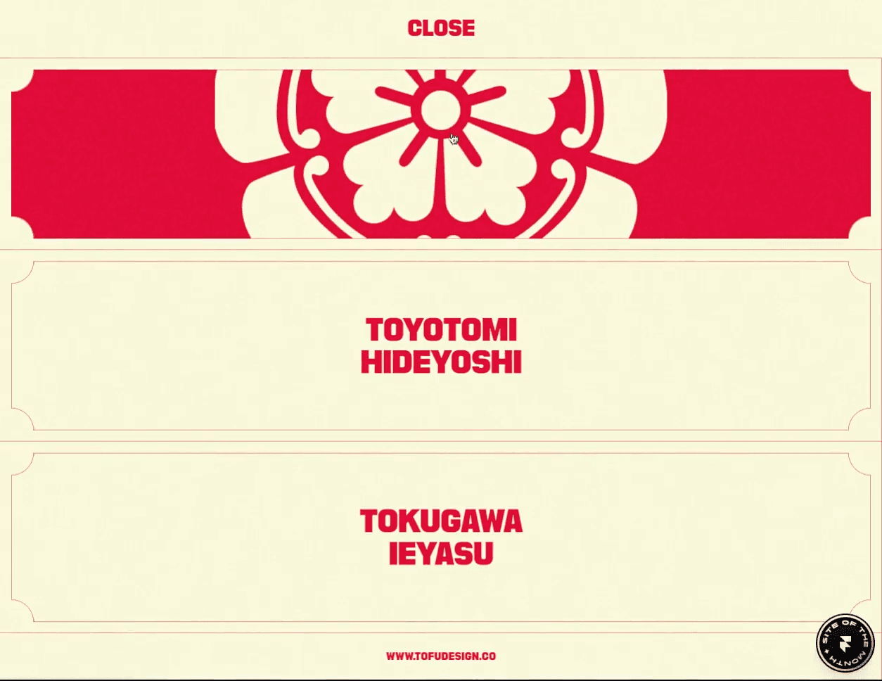
Unifiers of Japan is a highly-stylized website full of impressive animations. While its highlight is probably the dynamic figures from Japanese history who transform into samurais, the website also does a compelling job of integrating its branding into each detail of the user experience.
For example, the menu is populated by two sorts of hover effects. First, a subtle line appears under the word “Menu” when you hover over it. Second, hovering over each menu item causes the menu item to be smoothly replaced by a graphic. Each of these little interactions helps the website feel responsive to what users need while adding polish to the brand experience.
Light theme
1234

Lorem ipsum dolor sit amet, consectetur adipiscing elit, sed do eiusmod tempor incididunt ut labore et dolore magna aliqua.
Animations do more than just look cool — they enhance the user experience. Whether it’s guiding attention, creating a sense of flow, or making interactions more intuitive, the right animations and interactivity can transform a static page into something that inspires users and drives action.
To inspire your next project, we’ve collected a set of stunning website animation examples from the Framer gallery. Explore how different types of animations — l ike hover effects, scroll-triggered transitions, and background animations — can differentiate your brand, enhance your user experience, and supercharge your conversion rates.
1. Background Animations
Adding background animations gives your website a sense of dynamism and interactivity. These effects can be subtle, as in the case of gradient animations; they can also be central to the design of your page, as many parallax backgrounds are. Either way, background animations are a way to enhance your site’s visual flow and set the tone as your visitors explore your site.
Example — Yuna

Yuna is an app that lets you create personalized, interactive children’s stories tailored to the age of your child. Parents say it fosters a love of reading and helps kids practice creativity and imagination. Yuna’s website does an excellent job of communicating that sense of wonder through storybook-like animations.
Parallax backgrounds play a big role here: three layers, moving at different speeds, show a parent reading to their child with colorful, slow-moving leaves and clouds in the foreground. As you scroll through the website, other visual features—like entrance animations and bouncing icons—reinforce this sense of playfulness.
2. Hover Effects
By using hover effects, you can signal to users which objects are clickable and important. Plus, it makes the experience of browsing your site more dynamic and engaging, while giving you a chance to reinforce your brand. Hover effects can be subtle, like adjusting the color, size, and orientation of buttons and menus, or more overt.
Example — Unifiers of Japan

Unifiers of Japan is a highly-stylized website full of impressive animations. While its highlight is probably the dynamic figures from Japanese history who transform into samurais, the website also does a compelling job of integrating its branding into each detail of the user experience.
For example, the menu is populated by two sorts of hover effects. First, a subtle line appears under the word “Menu” when you hover over it. Second, hovering over each menu item causes the menu item to be smoothly replaced by a graphic. Each of these little interactions helps the website feel responsive to what users need while adding polish to the brand experience.
Light theme
1234

Lorem ipsum dolor sit amet, consectetur adipiscing elit, sed do eiusmod tempor incididunt ut labore et dolore magna aliqua.
Animations do more than just look cool — they enhance the user experience. Whether it’s guiding attention, creating a sense of flow, or making interactions more intuitive, the right animations and interactivity can transform a static page into something that inspires users and drives action.
To inspire your next project, we’ve collected a set of stunning website animation examples from the Framer gallery. Explore how different types of animations — l ike hover effects, scroll-triggered transitions, and background animations — can differentiate your brand, enhance your user experience, and supercharge your conversion rates.
1. Background Animations
Adding background animations gives your website a sense of dynamism and interactivity. These effects can be subtle, as in the case of gradient animations; they can also be central to the design of your page, as many parallax backgrounds are. Either way, background animations are a way to enhance your site’s visual flow and set the tone as your visitors explore your site.
Example — Yuna

Yuna is an app that lets you create personalized, interactive children’s stories tailored to the age of your child. Parents say it fosters a love of reading and helps kids practice creativity and imagination. Yuna’s website does an excellent job of communicating that sense of wonder through storybook-like animations.
Parallax backgrounds play a big role here: three layers, moving at different speeds, show a parent reading to their child with colorful, slow-moving leaves and clouds in the foreground. As you scroll through the website, other visual features—like entrance animations and bouncing icons—reinforce this sense of playfulness.
2. Hover Effects
By using hover effects, you can signal to users which objects are clickable and important. Plus, it makes the experience of browsing your site more dynamic and engaging, while giving you a chance to reinforce your brand. Hover effects can be subtle, like adjusting the color, size, and orientation of buttons and menus, or more overt.
Example — Unifiers of Japan

Unifiers of Japan is a highly-stylized website full of impressive animations. While its highlight is probably the dynamic figures from Japanese history who transform into samurais, the website also does a compelling job of integrating its branding into each detail of the user experience.
For example, the menu is populated by two sorts of hover effects. First, a subtle line appears under the word “Menu” when you hover over it. Second, hovering over each menu item causes the menu item to be smoothly replaced by a graphic. Each of these little interactions helps the website feel responsive to what users need while adding polish to the brand experience.
Load More
Load More
Load More
Want to Get Started?
Don't miss out on the opportunity to revolutionize your logistics operations. Book a demo today to see our solutions in action.
Want to Get Started?
Don't miss out on the opportunity to revolutionize your logistics operations. Book a demo today to see our solutions in action.
Want to Get Started?
Don't miss out on the opportunity to revolutionize your logistics operations. Book a demo today to see our solutions in action.
© 2024 CONSOLID. All Rights Reserved.
Want to Get Started?
Don't miss out on the opportunity to revolutionize your logistics operations. Book a demo today to see our solutions in action.
© 2024 CONSOLID. All Rights Reserved.
Product
Solutions
Success stories
Company
Product
Solutions
Success stories
Company
