Light theme
1234

Lorem ipsum dolor sit amet, consectetur adipiscing elit, sed do eiusmod tempor incididunt ut labore et dolore magna aliqua.
ЮА do more than just look cool — they enhance the user experience. Whether it’s guiding attention, creating a sense of flow, or making interactions more intuitive, the right animations and interactivity can transform a static page into something that inspires users and drives action.
To inspire your next project, we’ve collected a set of stunning website animation examples from the Framer gallery. Explore how different types of animations — l ike hover effects, scroll-triggered transitions, and background animations — can differentiate your brand, enhance your user experience, and supercharge your conversion rates.
1. Background Animations
Adding background animations gives your website a sense of dynamism and interactivity. These effects can be subtle, as in the case of gradient animations; they can also be central to the design of your page, as many parallax backgrounds are. Either way, background animations are a way to enhance your site’s visual flow and set the tone as your visitors explore your site.
Example — Yuna

Yuna is an app that lets you create personalized, interactive children’s stories tailored to the age of your child. Parents say it fosters a love of reading and helps kids practice creativity and imagination. Yuna’s website does an excellent job of communicating that sense of wonder through storybook-like animations.
Parallax backgrounds play a big role here: three layers, moving at different speeds, show a parent reading to their child with colorful, slow-moving leaves and clouds in the foreground. As you scroll through the website, other visual features—like entrance animations and bouncing icons—reinforce this sense of playfulness.
2. Hover Effects
By using hover effects, you can signal to users which objects are clickable and important. Plus, it makes the experience of browsing your site more dynamic and engaging, while giving you a chance to reinforce your brand. Hover effects can be subtle, like adjusting the color, size, and orientation of buttons and menus, or more overt.
Example — Unifiers of Japan
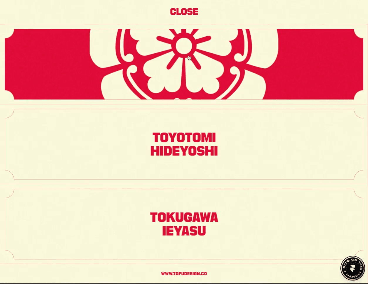
Unifiers of Japan is a highly-stylized website full of impressive animations. While its highlight is probably the dynamic figures from Japanese history who transform into samurais, the website also does a compelling job of integrating its branding into each detail of the user experience.
For example, the menu is populated by two sorts of hover effects. First, a subtle line appears under the word “Menu” when you hover over it. Second, hovering over each menu item causes the menu item to be smoothly replaced by a graphic. Each of these little interactions helps the website feel responsive to what users need while adding polish to the brand experience.
3. Page Transitions
Under normal circumstances, navigating from one part of a website to another isn’t much cause for fanfare: you just click a link and the next page loads. Page transitions—like having the next page smoothly fade in or slide in—add polish and professionalism to what is normally a routine experience.
Example — DynexDynex
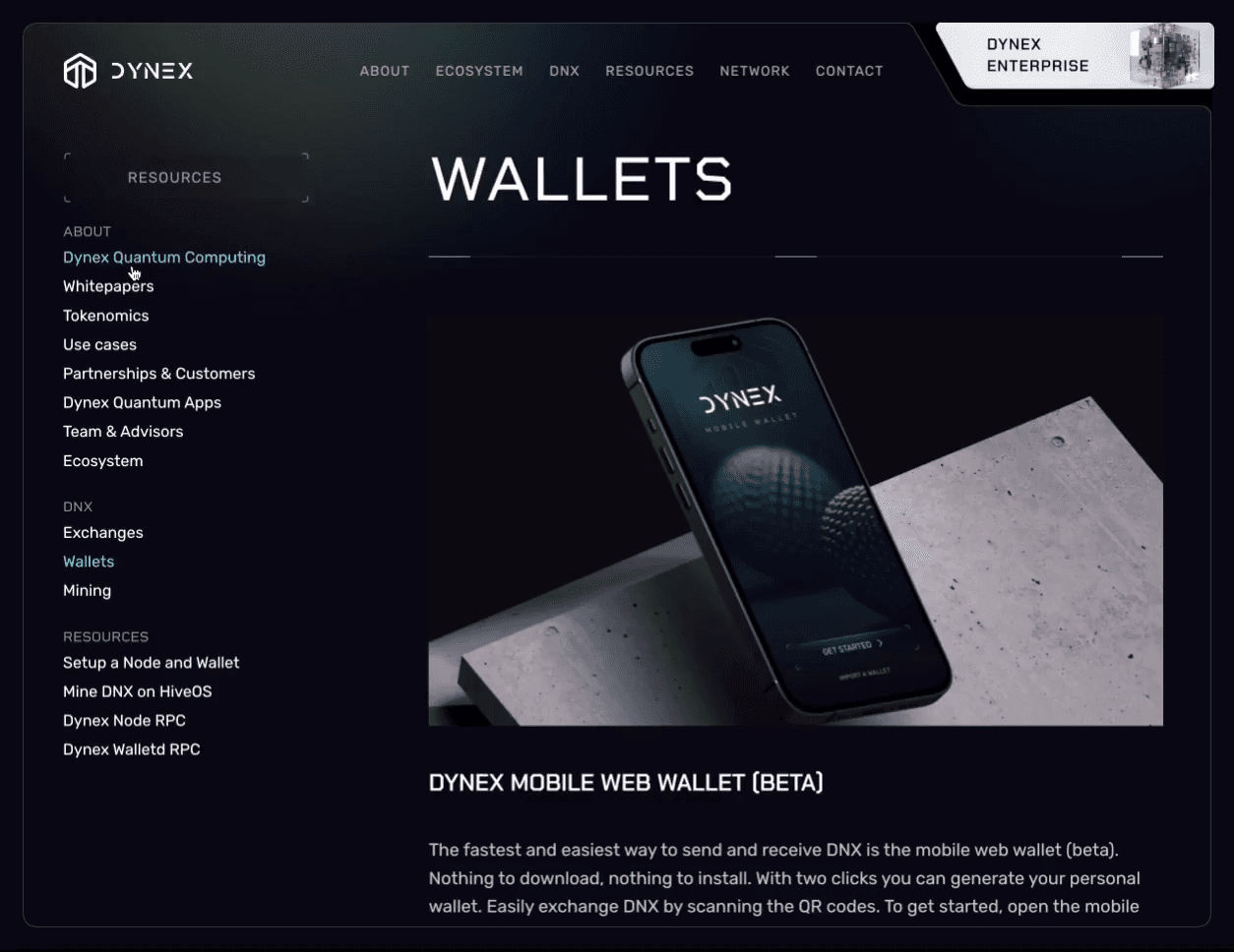
Dynex, a blockchain company focused on quantum computing, has a website that deals with some of the most technical subjects you can find. (Neuromorphic computing, anyone?) If there was ever a site that needed to look especially “tech-y,” this is it.
Fortunately, Dynex nails the details. Its sleek, futuristic aesthetic is on brand. Even the page transitions are thoughtfully designed: when you click a menu item, a smooth left-to-right animation fades the new page in. Page transitions aren’t always top of mind when launching a website project, but visitors do notice them (even if subconsciously) and they add to your site’s overall brand experience.
5 tips on how to do parallax scrolling in Framer
Parallax scrolling can feel a bit intimidating, especially if coding isn’t your strong suit. But with Framer, it can be a breeze—you can create those eye-catching effects with just a few clicks.
Here are some tips to help you nail parallax scrolling in Framer, so your designs look great and work smoothly:
Understanding layers and motion.
The foundation of parallax scrolling in Framer involves working with layers and controlling their movement. Start by setting up your design with multiple layers, each representing different elements like background, midground, and foreground.
In Framer, you can animate these layers at different speeds to create the illusion of depth as the user scrolls. Remember, the key is subtlety—too much movement can overwhelm the user.
Using scroll triggers.
One of the most powerful features in Framer is the ability to create scroll-triggered animations. This means you can set specific actions to occur when a user scrolls to a certain part of your page.
For example, you can animate a layer to move upward as the user scrolls down, or you can reveal elements gradually as they come into view. This technique is crucial for implementing engaging parallax effects.
Update to Framer’s Pricing Plans

We’re making Framer better for everyone. Whether you need a simple personal website or run a complex business with millions of monthly visitors, our website builder is here to help. Today, we’re updating our pricing to better serve all our customers.
Here’s what’s changing:
We are making personal plans more powerful
We are getting rid of workspace plans
We are adding business plans for Startups and Scaleups
We are making localization cheaper for personal use
Frequently asked questions
Do I have to pay more if I already have a subscription?
No, these changes will give you more without increasing your cost. New subscriptions will be billed at the updated pricing.
What if we’re currently on a Pro Workspace plan with a Mini, Basic, or Pro site plan?
You will keep access to Drafts and Project Permissions.
What if there are more editors in my workspace than my plan allows?
You can keep the current number of editors in your workspace without an increase in your bill. However, if you want to add more editors, we will ask you to upgrade to a plan that supports the required number of editors.
What determines the cost and limits for editors in my workspace now that the Workspace plans are gone?
You can have multiple plans in a workspace, and the price and limits for editors are determined by the highest-tier plan in your workspace. For example, if you have both a Startup and a Pro plan in your workspace, you will be billed $40 per additional editor per month (billed yearly), and you can have up to 6 editors in your workspace, including the owner.
What happens to my current Pro Locale subscription?
In the coming weeks, we will bundle all locale subscriptions with their respective project subscriptions. The locale subscriptions will be added to the current billing cycle of the site subscription. If you are on any of the personal plans, the cost for your locales will decrease to reflect the new pricing. After this change, locales will be billed automatically when you add or remove them.
1. First Request: WebP
On the first request, we serve the image as WebP, not as AVIF.
We also set the Cache-Control header to max-age=0, stale-while-revalidate=31536000
2. Immediate Expiry
Because max-age is set to 0, the WebP image expires immediately. This prompts the CDN to forward the second request to us.
3. Second Request: AVIF
When the second request arrives, we serve the image as AVIF.
Responding to the second request can take several seconds because AVIF conversion is slow. But thanks to stale-while-revalidate, our CDN (CloudFront) keeps serving the WebP image until the conversion is complete.
We recognize the second request from the first by the If-None-Match header. Only the second request has it.
When the AVIF image is ready, we return it with Cache-Control: max-age=31536000. This allows the CDN to cache and serve it for a long time.
This works surprisingly well – and, best of all, allows us to keep our infrastructure simple. If not for this trick, we’d need to implement a separate queueing system for converting images in the background. But with this trick, we don’t need to – so there’s no extra complexity and no extra bugs.
How to Boost User Engagement with Website Animations
With Framer, you can easily add engagement-boosting animations while balancing creativity, usability, performance, and accessibility. Here are some practical tips to get started.
1. Give Each Animation A Purpose
It’s easy to overuse animation. If bouncing logos and parallax backgrounds don’t fit with your brand, you can keep things simple—don’t animate your site just because you can.
Instead, make sure each animation improves your user experience, enhances your brand experience, or both. Start by using subtle animations like hover effects, which help users understand which areas of the site are interactive. Later, add advanced effects like scroll-triggered animations to manage the flow of information that users see.
2. Keep Users Engaged with Microinteractions
Framer’s animation features let you use microinteractions to drive user engagement and incorporate your brand throughout your design.
Start by incorporating interactive calls-to-action that change color, grow, or pulse based on users’ behavior. For example, a pulsating “Buy Now” button can draw attention and prompt users to take action. You can also add subtle animations that provide reinforcement when users complete tasks or input information correctly.
3. Prioritize Performance and Load Times
Framer offers lightweight animations and lazy loading for off-screen content, helping your website run smoothly even with multiple animations.
But it’s still important to check page load times to make sure your user experience isn’t compromised. If you’re experiencing poor performance, consider switching to lightweight CSS animations, enabling lazy loading, and optimizing any images and videos you’ve uploaded; you may also need to reduce the number of animations you’re using.
Make your website come alive with Framer’s animations
With Framer, you can go beyond static design and transform your website into a dynamic experience that captivates users from the moment they land on your page.By incorporating hover effects, scroll-triggered transitions, and other animations, you can enhance your site’s aesthetic appeal, guide user behavior, and boost conversion rates.Ready to make your site come alive with animations? Get inspiration from our latest examples in the Framer animations gallery, kickstart your design with one of our templates, and sign up for a Framer account to start animating your website today.
5 Ways to Add Motion to Your Website’s Text
Bringing motion to your website’s text can elevate the user experience and make your content more engaging. Framer’s new text effects feature gives you the tools to animate text effortlessly. Here are five ways to use it:
Highlight key information with appearing text
Use Framer’s Appear trigger to make important text pop into view as users scroll. You can apply effects like Scale or Blur to create smooth transitions that emphasize headings or calls-to-action, drawing attention where it’s needed most.
Animate text on hover for interactivity
Framer allows you to add subtle hover-triggered text animations, such as shifting or scaling text when a user hovers over it. This adds an interactive layer to your site and encourages users to engage more with the content.
How to make an effective storytelling website
Building a storytelling website requires a thoughtful blend of design, content, and functionality. Here’s a structured plan to help you build a site in Framer that effectively tells your story.
Step 1: Visualize your story
Consider how typography will enhance your storytelling. The right font can set the tone and mood for your narrative. Framer offers a rich library of built-in and custom fonts that allows you to select the perfect typeface for your story.
Step 3: Connect your pages and sections
To create a cohesive storytelling experience, you need to guide visitors through your site in a logical and engaging way. Framer’s navigation tools make it easy to link different pages and sections, allowing you to take users on a journey through your narrative.
Step 4: Add interactive elements
Interactive elements can make your story more captivating. Framer’s web animations, like appear and scroll effects, enable you to add subtle motion and transitions that make your site feel alive. These animations can highlight key parts of your story without distracting from the overall content, adding depth and interest to your design.
Elevate Your Website with Dynamic Text Animations
From simple hover effects to more complex scroll-triggered sequences, these animations make your site feel dynamic and interactive.
Ready to see how text animations can transform your site? Check out our gallery for fresh inspiration, try out a few of our animated website templates, and sign up for Framer to start building a website that moves your visitors in more ways than one.
Light theme
1234

Lorem ipsum dolor sit amet, consectetur adipiscing elit, sed do eiusmod tempor incididunt ut labore et dolore magna aliqua.
ЮА do more than just look cool — they enhance the user experience. Whether it’s guiding attention, creating a sense of flow, or making interactions more intuitive, the right animations and interactivity can transform a static page into something that inspires users and drives action.
To inspire your next project, we’ve collected a set of stunning website animation examples from the Framer gallery. Explore how different types of animations — l ike hover effects, scroll-triggered transitions, and background animations — can differentiate your brand, enhance your user experience, and supercharge your conversion rates.
1. Background Animations
Adding background animations gives your website a sense of dynamism and interactivity. These effects can be subtle, as in the case of gradient animations; they can also be central to the design of your page, as many parallax backgrounds are. Either way, background animations are a way to enhance your site’s visual flow and set the tone as your visitors explore your site.
Example — Yuna

Yuna is an app that lets you create personalized, interactive children’s stories tailored to the age of your child. Parents say it fosters a love of reading and helps kids practice creativity and imagination. Yuna’s website does an excellent job of communicating that sense of wonder through storybook-like animations.
Parallax backgrounds play a big role here: three layers, moving at different speeds, show a parent reading to their child with colorful, slow-moving leaves and clouds in the foreground. As you scroll through the website, other visual features—like entrance animations and bouncing icons—reinforce this sense of playfulness.
2. Hover Effects
By using hover effects, you can signal to users which objects are clickable and important. Plus, it makes the experience of browsing your site more dynamic and engaging, while giving you a chance to reinforce your brand. Hover effects can be subtle, like adjusting the color, size, and orientation of buttons and menus, or more overt.
Example — Unifiers of Japan

Unifiers of Japan is a highly-stylized website full of impressive animations. While its highlight is probably the dynamic figures from Japanese history who transform into samurais, the website also does a compelling job of integrating its branding into each detail of the user experience.
For example, the menu is populated by two sorts of hover effects. First, a subtle line appears under the word “Menu” when you hover over it. Second, hovering over each menu item causes the menu item to be smoothly replaced by a graphic. Each of these little interactions helps the website feel responsive to what users need while adding polish to the brand experience.
3. Page Transitions
Under normal circumstances, navigating from one part of a website to another isn’t much cause for fanfare: you just click a link and the next page loads. Page transitions—like having the next page smoothly fade in or slide in—add polish and professionalism to what is normally a routine experience.
Example — DynexDynex

Dynex, a blockchain company focused on quantum computing, has a website that deals with some of the most technical subjects you can find. (Neuromorphic computing, anyone?) If there was ever a site that needed to look especially “tech-y,” this is it.
Fortunately, Dynex nails the details. Its sleek, futuristic aesthetic is on brand. Even the page transitions are thoughtfully designed: when you click a menu item, a smooth left-to-right animation fades the new page in. Page transitions aren’t always top of mind when launching a website project, but visitors do notice them (even if subconsciously) and they add to your site’s overall brand experience.
5 tips on how to do parallax scrolling in Framer
Parallax scrolling can feel a bit intimidating, especially if coding isn’t your strong suit. But with Framer, it can be a breeze—you can create those eye-catching effects with just a few clicks.
Here are some tips to help you nail parallax scrolling in Framer, so your designs look great and work smoothly:
Understanding layers and motion.
The foundation of parallax scrolling in Framer involves working with layers and controlling their movement. Start by setting up your design with multiple layers, each representing different elements like background, midground, and foreground.
In Framer, you can animate these layers at different speeds to create the illusion of depth as the user scrolls. Remember, the key is subtlety—too much movement can overwhelm the user.
Using scroll triggers.
One of the most powerful features in Framer is the ability to create scroll-triggered animations. This means you can set specific actions to occur when a user scrolls to a certain part of your page.
For example, you can animate a layer to move upward as the user scrolls down, or you can reveal elements gradually as they come into view. This technique is crucial for implementing engaging parallax effects.
Update to Framer’s Pricing Plans

We’re making Framer better for everyone. Whether you need a simple personal website or run a complex business with millions of monthly visitors, our website builder is here to help. Today, we’re updating our pricing to better serve all our customers.
Here’s what’s changing:
We are making personal plans more powerful
We are getting rid of workspace plans
We are adding business plans for Startups and Scaleups
We are making localization cheaper for personal use
Frequently asked questions
Do I have to pay more if I already have a subscription?
No, these changes will give you more without increasing your cost. New subscriptions will be billed at the updated pricing.
What if we’re currently on a Pro Workspace plan with a Mini, Basic, or Pro site plan?
You will keep access to Drafts and Project Permissions.
What if there are more editors in my workspace than my plan allows?
You can keep the current number of editors in your workspace without an increase in your bill. However, if you want to add more editors, we will ask you to upgrade to a plan that supports the required number of editors.
What determines the cost and limits for editors in my workspace now that the Workspace plans are gone?
You can have multiple plans in a workspace, and the price and limits for editors are determined by the highest-tier plan in your workspace. For example, if you have both a Startup and a Pro plan in your workspace, you will be billed $40 per additional editor per month (billed yearly), and you can have up to 6 editors in your workspace, including the owner.
What happens to my current Pro Locale subscription?
In the coming weeks, we will bundle all locale subscriptions with their respective project subscriptions. The locale subscriptions will be added to the current billing cycle of the site subscription. If you are on any of the personal plans, the cost for your locales will decrease to reflect the new pricing. After this change, locales will be billed automatically when you add or remove them.
1. First Request: WebP
On the first request, we serve the image as WebP, not as AVIF.
We also set the Cache-Control header to max-age=0, stale-while-revalidate=31536000
2. Immediate Expiry
Because max-age is set to 0, the WebP image expires immediately. This prompts the CDN to forward the second request to us.
3. Second Request: AVIF
When the second request arrives, we serve the image as AVIF.
Responding to the second request can take several seconds because AVIF conversion is slow. But thanks to stale-while-revalidate, our CDN (CloudFront) keeps serving the WebP image until the conversion is complete.
We recognize the second request from the first by the If-None-Match header. Only the second request has it.
When the AVIF image is ready, we return it with Cache-Control: max-age=31536000. This allows the CDN to cache and serve it for a long time.
This works surprisingly well – and, best of all, allows us to keep our infrastructure simple. If not for this trick, we’d need to implement a separate queueing system for converting images in the background. But with this trick, we don’t need to – so there’s no extra complexity and no extra bugs.
How to Boost User Engagement with Website Animations
With Framer, you can easily add engagement-boosting animations while balancing creativity, usability, performance, and accessibility. Here are some practical tips to get started.
1. Give Each Animation A Purpose
It’s easy to overuse animation. If bouncing logos and parallax backgrounds don’t fit with your brand, you can keep things simple—don’t animate your site just because you can.
Instead, make sure each animation improves your user experience, enhances your brand experience, or both. Start by using subtle animations like hover effects, which help users understand which areas of the site are interactive. Later, add advanced effects like scroll-triggered animations to manage the flow of information that users see.
2. Keep Users Engaged with Microinteractions
Framer’s animation features let you use microinteractions to drive user engagement and incorporate your brand throughout your design.
Start by incorporating interactive calls-to-action that change color, grow, or pulse based on users’ behavior. For example, a pulsating “Buy Now” button can draw attention and prompt users to take action. You can also add subtle animations that provide reinforcement when users complete tasks or input information correctly.
3. Prioritize Performance and Load Times
Framer offers lightweight animations and lazy loading for off-screen content, helping your website run smoothly even with multiple animations.
But it’s still important to check page load times to make sure your user experience isn’t compromised. If you’re experiencing poor performance, consider switching to lightweight CSS animations, enabling lazy loading, and optimizing any images and videos you’ve uploaded; you may also need to reduce the number of animations you’re using.
Make your website come alive with Framer’s animations
With Framer, you can go beyond static design and transform your website into a dynamic experience that captivates users from the moment they land on your page.By incorporating hover effects, scroll-triggered transitions, and other animations, you can enhance your site’s aesthetic appeal, guide user behavior, and boost conversion rates.Ready to make your site come alive with animations? Get inspiration from our latest examples in the Framer animations gallery, kickstart your design with one of our templates, and sign up for a Framer account to start animating your website today.
5 Ways to Add Motion to Your Website’s Text
Bringing motion to your website’s text can elevate the user experience and make your content more engaging. Framer’s new text effects feature gives you the tools to animate text effortlessly. Here are five ways to use it:
Highlight key information with appearing text
Use Framer’s Appear trigger to make important text pop into view as users scroll. You can apply effects like Scale or Blur to create smooth transitions that emphasize headings or calls-to-action, drawing attention where it’s needed most.
Animate text on hover for interactivity
Framer allows you to add subtle hover-triggered text animations, such as shifting or scaling text when a user hovers over it. This adds an interactive layer to your site and encourages users to engage more with the content.
How to make an effective storytelling website
Building a storytelling website requires a thoughtful blend of design, content, and functionality. Here’s a structured plan to help you build a site in Framer that effectively tells your story.

Step 1: Visualize your story
Consider how typography will enhance your storytelling. The right font can set the tone and mood for your narrative. Framer offers a rich library of built-in and custom fonts that allows you to select the perfect typeface for your story.
Step 3: Connect your pages and sections
To create a cohesive storytelling experience, you need to guide visitors through your site in a logical and engaging way. Framer’s navigation tools make it easy to link different pages and sections, allowing you to take users on a journey through your narrative.
Step 4: Add interactive elements
Interactive elements can make your story more captivating. Framer’s web animations, like appear and scroll effects, enable you to add subtle motion and transitions that make your site feel alive. These animations can highlight key parts of your story without distracting from the overall content, adding depth and interest to your design.
Elevate Your Website with Dynamic Text Animations
From simple hover effects to more complex scroll-triggered sequences, these animations make your site feel dynamic and interactive.
Ready to see how text animations can transform your site? Check out our gallery for fresh inspiration, try out a few of our animated website templates, and sign up for Framer to start building a website that moves your visitors in more ways than one.
Light theme
1234

Lorem ipsum dolor sit amet, consectetur adipiscing elit, sed do eiusmod tempor incididunt ut labore et dolore magna aliqua.
ЮА do more than just look cool — they enhance the user experience. Whether it’s guiding attention, creating a sense of flow, or making interactions more intuitive, the right animations and interactivity can transform a static page into something that inspires users and drives action.
To inspire your next project, we’ve collected a set of stunning website animation examples from the Framer gallery. Explore how different types of animations — l ike hover effects, scroll-triggered transitions, and background animations — can differentiate your brand, enhance your user experience, and supercharge your conversion rates.
1. Background Animations
Adding background animations gives your website a sense of dynamism and interactivity. These effects can be subtle, as in the case of gradient animations; they can also be central to the design of your page, as many parallax backgrounds are. Either way, background animations are a way to enhance your site’s visual flow and set the tone as your visitors explore your site.
Example — Yuna

Yuna is an app that lets you create personalized, interactive children’s stories tailored to the age of your child. Parents say it fosters a love of reading and helps kids practice creativity and imagination. Yuna’s website does an excellent job of communicating that sense of wonder through storybook-like animations.
Parallax backgrounds play a big role here: three layers, moving at different speeds, show a parent reading to their child with colorful, slow-moving leaves and clouds in the foreground. As you scroll through the website, other visual features—like entrance animations and bouncing icons—reinforce this sense of playfulness.
2. Hover Effects
By using hover effects, you can signal to users which objects are clickable and important. Plus, it makes the experience of browsing your site more dynamic and engaging, while giving you a chance to reinforce your brand. Hover effects can be subtle, like adjusting the color, size, and orientation of buttons and menus, or more overt.
Example — Unifiers of Japan

Unifiers of Japan is a highly-stylized website full of impressive animations. While its highlight is probably the dynamic figures from Japanese history who transform into samurais, the website also does a compelling job of integrating its branding into each detail of the user experience.
For example, the menu is populated by two sorts of hover effects. First, a subtle line appears under the word “Menu” when you hover over it. Second, hovering over each menu item causes the menu item to be smoothly replaced by a graphic. Each of these little interactions helps the website feel responsive to what users need while adding polish to the brand experience.
3. Page Transitions
Under normal circumstances, navigating from one part of a website to another isn’t much cause for fanfare: you just click a link and the next page loads. Page transitions—like having the next page smoothly fade in or slide in—add polish and professionalism to what is normally a routine experience.
Example — DynexDynex

Dynex, a blockchain company focused on quantum computing, has a website that deals with some of the most technical subjects you can find. (Neuromorphic computing, anyone?) If there was ever a site that needed to look especially “tech-y,” this is it.
Fortunately, Dynex nails the details. Its sleek, futuristic aesthetic is on brand. Even the page transitions are thoughtfully designed: when you click a menu item, a smooth left-to-right animation fades the new page in. Page transitions aren’t always top of mind when launching a website project, but visitors do notice them (even if subconsciously) and they add to your site’s overall brand experience.
5 tips on how to do parallax scrolling in Framer
Parallax scrolling can feel a bit intimidating, especially if coding isn’t your strong suit. But with Framer, it can be a breeze—you can create those eye-catching effects with just a few clicks.
Here are some tips to help you nail parallax scrolling in Framer, so your designs look great and work smoothly:
Understanding layers and motion.
The foundation of parallax scrolling in Framer involves working with layers and controlling their movement. Start by setting up your design with multiple layers, each representing different elements like background, midground, and foreground.
In Framer, you can animate these layers at different speeds to create the illusion of depth as the user scrolls. Remember, the key is subtlety—too much movement can overwhelm the user.
Using scroll triggers.
One of the most powerful features in Framer is the ability to create scroll-triggered animations. This means you can set specific actions to occur when a user scrolls to a certain part of your page.
For example, you can animate a layer to move upward as the user scrolls down, or you can reveal elements gradually as they come into view. This technique is crucial for implementing engaging parallax effects.
Update to Framer’s Pricing Plans

We’re making Framer better for everyone. Whether you need a simple personal website or run a complex business with millions of monthly visitors, our website builder is here to help. Today, we’re updating our pricing to better serve all our customers.
Here’s what’s changing:
We are making personal plans more powerful
We are getting rid of workspace plans
We are adding business plans for Startups and Scaleups
We are making localization cheaper for personal use
Frequently asked questions
Do I have to pay more if I already have a subscription?
No, these changes will give you more without increasing your cost. New subscriptions will be billed at the updated pricing.
What if we’re currently on a Pro Workspace plan with a Mini, Basic, or Pro site plan?
You will keep access to Drafts and Project Permissions.
What if there are more editors in my workspace than my plan allows?
You can keep the current number of editors in your workspace without an increase in your bill. However, if you want to add more editors, we will ask you to upgrade to a plan that supports the required number of editors.
What determines the cost and limits for editors in my workspace now that the Workspace plans are gone?
You can have multiple plans in a workspace, and the price and limits for editors are determined by the highest-tier plan in your workspace. For example, if you have both a Startup and a Pro plan in your workspace, you will be billed $40 per additional editor per month (billed yearly), and you can have up to 6 editors in your workspace, including the owner.
What happens to my current Pro Locale subscription?
In the coming weeks, we will bundle all locale subscriptions with their respective project subscriptions. The locale subscriptions will be added to the current billing cycle of the site subscription. If you are on any of the personal plans, the cost for your locales will decrease to reflect the new pricing. After this change, locales will be billed automatically when you add or remove them.
1. First Request: WebP
On the first request, we serve the image as WebP, not as AVIF.
We also set the Cache-Control header to max-age=0, stale-while-revalidate=31536000
2. Immediate Expiry
Because max-age is set to 0, the WebP image expires immediately. This prompts the CDN to forward the second request to us.
3. Second Request: AVIF
When the second request arrives, we serve the image as AVIF.
Responding to the second request can take several seconds because AVIF conversion is slow. But thanks to stale-while-revalidate, our CDN (CloudFront) keeps serving the WebP image until the conversion is complete.
We recognize the second request from the first by the If-None-Match header. Only the second request has it.
When the AVIF image is ready, we return it with Cache-Control: max-age=31536000. This allows the CDN to cache and serve it for a long time.
This works surprisingly well – and, best of all, allows us to keep our infrastructure simple. If not for this trick, we’d need to implement a separate queueing system for converting images in the background. But with this trick, we don’t need to – so there’s no extra complexity and no extra bugs.
How to Boost User Engagement with Website Animations
With Framer, you can easily add engagement-boosting animations while balancing creativity, usability, performance, and accessibility. Here are some practical tips to get started.
1. Give Each Animation A Purpose
It’s easy to overuse animation. If bouncing logos and parallax backgrounds don’t fit with your brand, you can keep things simple—don’t animate your site just because you can.
Instead, make sure each animation improves your user experience, enhances your brand experience, or both. Start by using subtle animations like hover effects, which help users understand which areas of the site are interactive. Later, add advanced effects like scroll-triggered animations to manage the flow of information that users see.
2. Keep Users Engaged with Microinteractions
Framer’s animation features let you use microinteractions to drive user engagement and incorporate your brand throughout your design.
Start by incorporating interactive calls-to-action that change color, grow, or pulse based on users’ behavior. For example, a pulsating “Buy Now” button can draw attention and prompt users to take action. You can also add subtle animations that provide reinforcement when users complete tasks or input information correctly.
3. Prioritize Performance and Load Times
Framer offers lightweight animations and lazy loading for off-screen content, helping your website run smoothly even with multiple animations.
But it’s still important to check page load times to make sure your user experience isn’t compromised. If you’re experiencing poor performance, consider switching to lightweight CSS animations, enabling lazy loading, and optimizing any images and videos you’ve uploaded; you may also need to reduce the number of animations you’re using.
Make your website come alive with Framer’s animations
With Framer, you can go beyond static design and transform your website into a dynamic experience that captivates users from the moment they land on your page.By incorporating hover effects, scroll-triggered transitions, and other animations, you can enhance your site’s aesthetic appeal, guide user behavior, and boost conversion rates.Ready to make your site come alive with animations? Get inspiration from our latest examples in the Framer animations gallery, kickstart your design with one of our templates, and sign up for a Framer account to start animating your website today.
5 Ways to Add Motion to Your Website’s Text
Bringing motion to your website’s text can elevate the user experience and make your content more engaging. Framer’s new text effects feature gives you the tools to animate text effortlessly. Here are five ways to use it:
Highlight key information with appearing text
Use Framer’s Appear trigger to make important text pop into view as users scroll. You can apply effects like Scale or Blur to create smooth transitions that emphasize headings or calls-to-action, drawing attention where it’s needed most.
Animate text on hover for interactivity
Framer allows you to add subtle hover-triggered text animations, such as shifting or scaling text when a user hovers over it. This adds an interactive layer to your site and encourages users to engage more with the content.
How to make an effective storytelling website
Building a storytelling website requires a thoughtful blend of design, content, and functionality. Here’s a structured plan to help you build a site in Framer that effectively tells your story.

Step 1: Visualize your story
Consider how typography will enhance your storytelling. The right font can set the tone and mood for your narrative. Framer offers a rich library of built-in and custom fonts that allows you to select the perfect typeface for your story.
Step 3: Connect your pages and sections
To create a cohesive storytelling experience, you need to guide visitors through your site in a logical and engaging way. Framer’s navigation tools make it easy to link different pages and sections, allowing you to take users on a journey through your narrative.
Step 4: Add interactive elements
Interactive elements can make your story more captivating. Framer’s web animations, like appear and scroll effects, enable you to add subtle motion and transitions that make your site feel alive. These animations can highlight key parts of your story without distracting from the overall content, adding depth and interest to your design.
Elevate Your Website with Dynamic Text Animations
From simple hover effects to more complex scroll-triggered sequences, these animations make your site feel dynamic and interactive.
Ready to see how text animations can transform your site? Check out our gallery for fresh inspiration, try out a few of our animated website templates, and sign up for Framer to start building a website that moves your visitors in more ways than one.
Load More
Load More
Load More
Хочете почати?
Не пропустіть можливість оптимізувати свої логістику. Заплануйти з нами дзвінок і ми вам розкажемо, як ви можете це зробити вже сьогодні.
Хочете почати?
Не пропустіть можливість оптимізувати свої логістику. Заплануйти з нами дзвінок і ми вам розкажемо, як ви можете це зробити вже сьогодні.
Хочете почати?
Не пропустіть можливість оптимізувати свої логістику. Заплануйти з нами дзвінок і ми вам розкажемо, як ви можете це зробити вже сьогодні.
Дізнайтеся більше
© 2024 CONSOLID. All Rights Reserved.
Хочете почати?
Не пропустіть можливість оптимізувати свої логістику. Заплануйти з нами дзвінок і ми вам розкажемо, як ви можете це зробити вже сьогодні.
Дізнайтеся більше
© 2024 CONSOLID. All Rights Reserved.
Продукт
Рішення
Історії успіху
Компанія
Продукт
Рішення
Історії успіху
Компанія
